
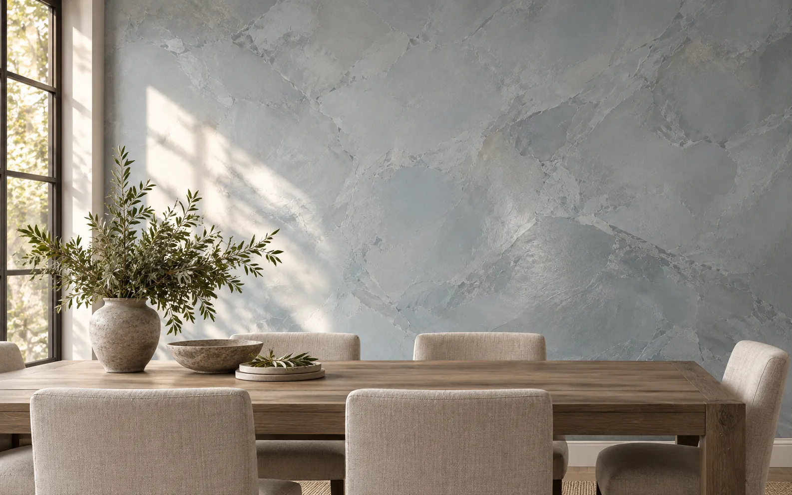
Blue can bring calm to a room, but it need not be vivid to be noticed. A grayed, mineral blue gives a wall color without making the whole room orbit around it. In summer daylight it may seem airy; in the evening it can settle into something quieter and deeper.
A decorative plaster finish adds another register. Where a flat swatch is one uninterrupted note, troweled movement gives the light small changes in texture to travel across. Venetian Gem can be tinted and worked into layered color with a softer, less metallic character than a low-luster metallic plaster.
Pair the blue with materials already doing work in the room. Oak and warm white keep it approachable; dark trim sharpens its edge; cool stone can make the same blue feel more architectural. Look at more than the wall: rugs, upholstery, neighboring rooms, and reflected light all take part in the palette.
Try a sample at the scale of a larger board and move it around the room. Compare the color near the window, away from it, and against the flooring. The most convincing blue is the one that still feels connected to the home after the first impression passes.