
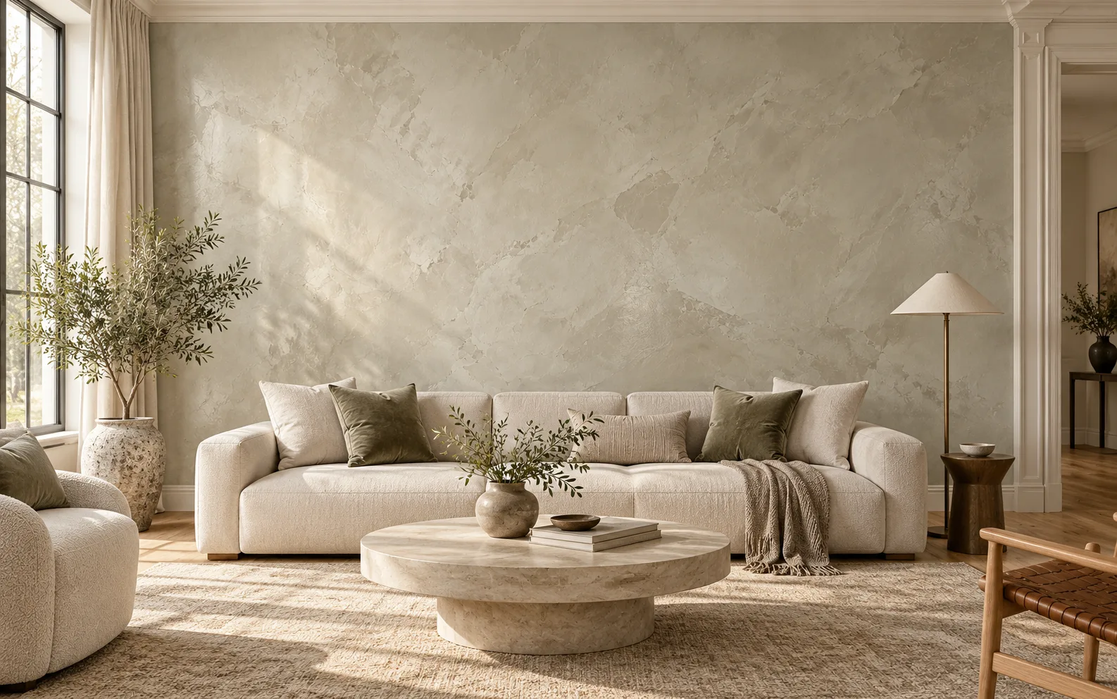
The names often arrive in the same conversation, but they are not two shades of one material. Venetian Gem and LusterStone are distinct decorative-plaster systems, each made to build color and movement on a wall. Both borrow from the layered, stone-like language of Italian plasterwork; neither is the same material or process as historic Venetian plaster.
LusterStone is a low-luster metallic plaster. Its troweled highs and lows create a quiet reflection that wakes up when daylight skims across the wall. The effect can feel almost like a mineral glint at the rim of a glass: present, but changing with the angle. If you love a little light on the surface, it gives a room that extra dimension. If you would rather skip metallic reflection, it may not be your first choice.
Venetian Gem is an acrylic-and-marble-dust plaster that can be tinted and layered. Burnishing can deepen its color and reveal a soft sheen, giving it a more stone-like, tonal character. It is the gentler counterpoint for someone who wants depth and hand-worked movement without as much metallic glimmer. It is not simply flat paint, though; its surface still responds to light.
Think of the choice as two different finishes on the same palette: LusterStone has a subtle glint; Venetian Gem carries a softer, more color-led body. Neither is universally better. Gray, pale green, muted blue, and warm white can all work, but the window direction, floor, trim, and neighboring colors change the reading from morning to evening.
A photo or a small chip cannot settle that last question. Put a physical sample in the room and look at it more than once: in daylight, after the lamps come on, and beside the materials that will stay. The right finish should feel at home with the architecture instead of competing with it.